[Case 02]
Parfois - Female brand awareness phi-gital campaign
Fashion & Retail
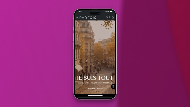
Phygital awareness campaign for Parfois in France
A strategic initiative to engage French consumers and drive in-store traffic
[Project Overview]
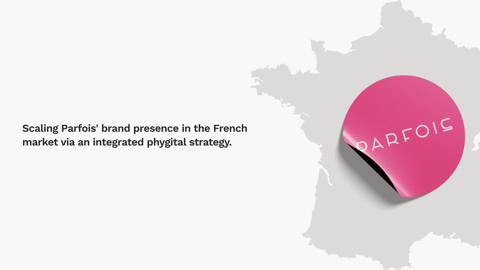
#JeSuisTout is a 360° phi-gital campaign designed to expand Parfois’ brand presence in the French market through an integrated phygital experience.
[Problem Statement]
Despite strong performance in neighboring European markets, Parfois saw a disconnect in French consumer conversion. Our task was to analyze this market underperformance and develop a 360° phygital experience designed to drive French customers into physical stores and stabilize regional profitability.
[Industry]
Fashion & Retail
[My role]
Team project, end-to-end design
[Platforms]
Desktop and Android
[Timeline]
July 2025
[Research]
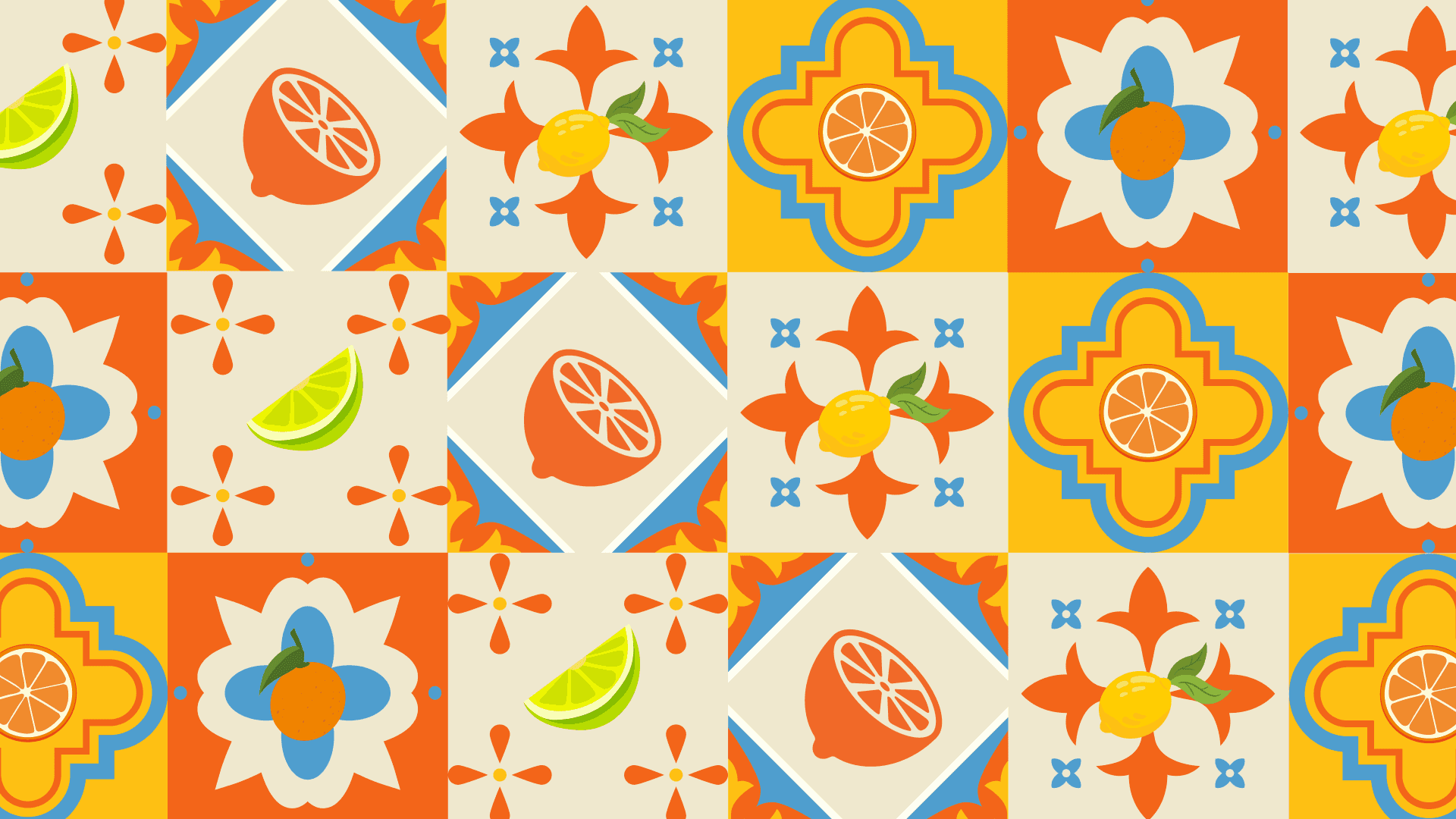
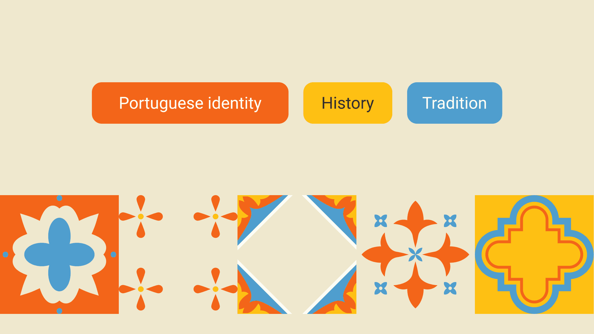
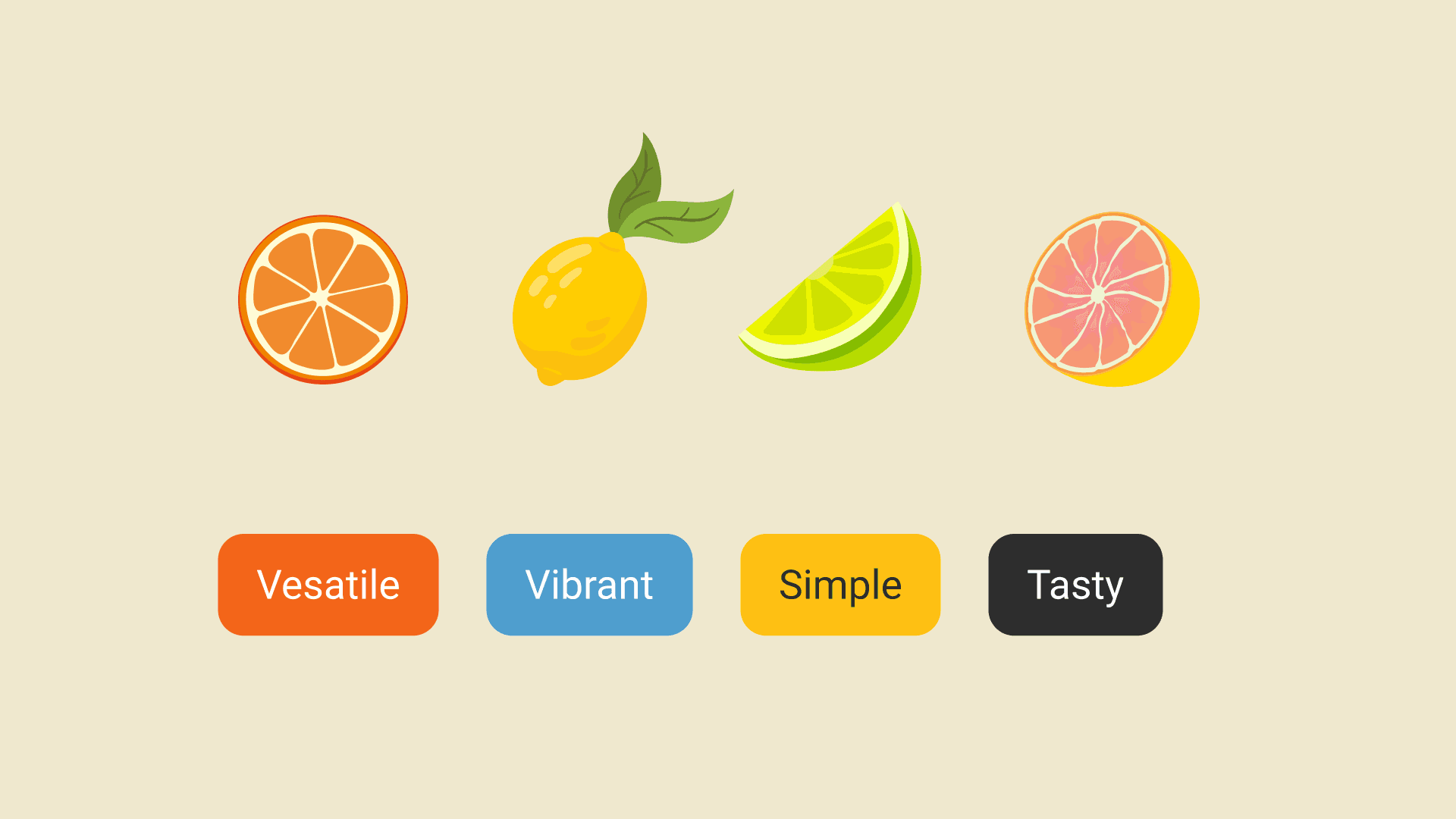
Visual Design
[Final Result]

Isabelle
Social Media Manager
I wear pieces that speak for me, so I don't have to say a word.
Age: 27
Location: Paris
Tech Proficiency: Moderate
Gender: Female
[Goal]
Be able to see customer reviews of the products.
Affordable return options and short shipping times.
Have authentic customer experience.
[Frustrations]
It looks better online than it feels in person.
Not being able to find the "Real" reviews.
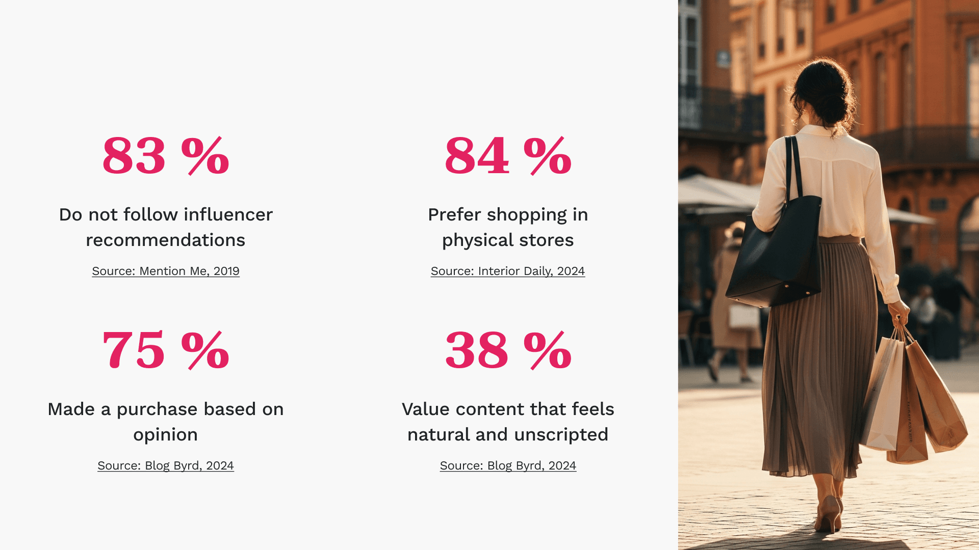
Tired of scripted influencer content; craves peer-to-peer validation at the point of sale.
[Process]
[01] User Research
Conducted user interviews with 22 participants to understand their frustrations and get some insights.
Analyzed customer behavior data to pinpoint preferences and motivations.
Benchmarked against competitors to identify best practices for checkout flows.
[02] Insights
[03 Design Solution]
[04] Testing & Iteration
Gathered feedback through usability testing and refined the design based on user input.
Designed a mobile-first landing page.
[Flows]
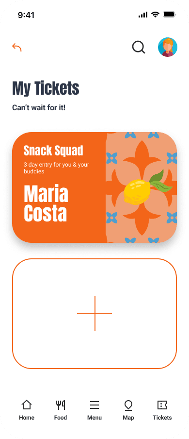
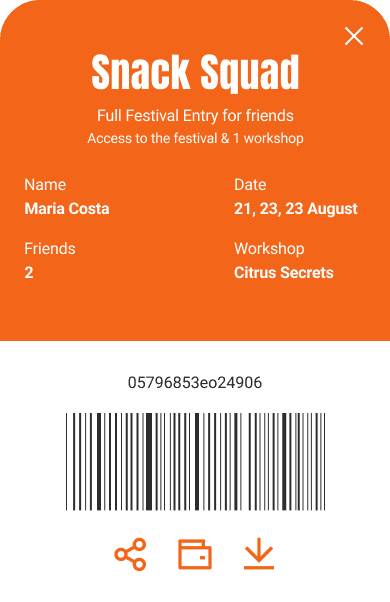
[01] Mobile - Ticket Checkout Process: Home > Tickets > Choose Snack Squad > Buy > Login > Create Account > Ticket Purshase - step 1 > Ticket Purshase - step 2 > Ticket Purshase - step 3 > Ticket Purchase Confirmation > Profile Account page > My tickets > Ticket in account (download/save to wallet/share)
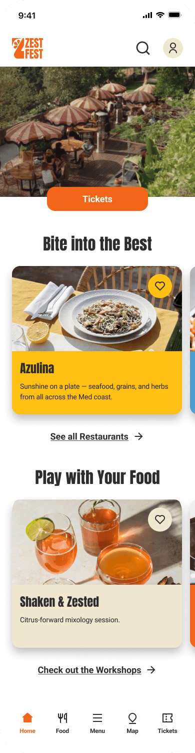
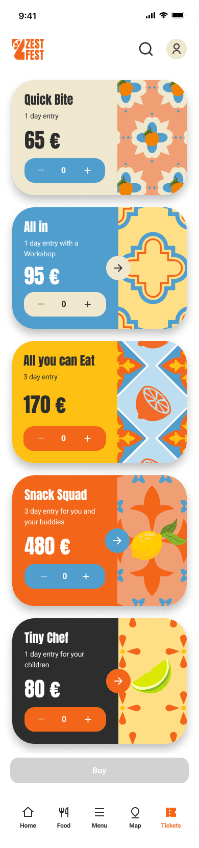
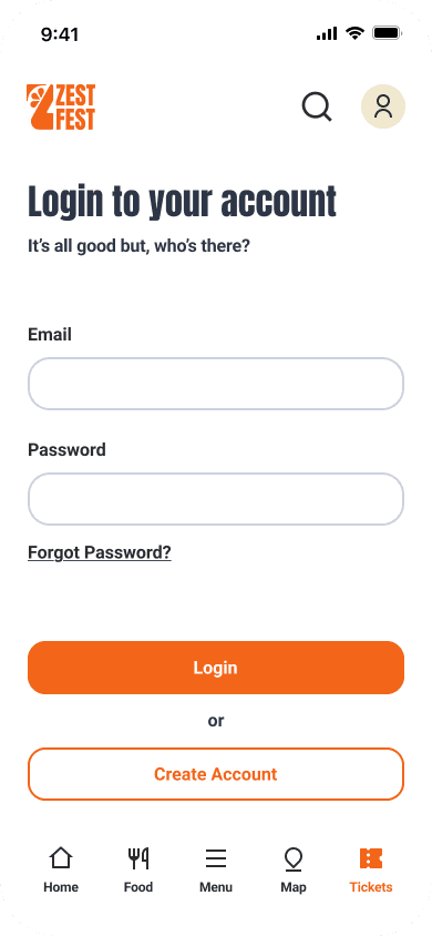
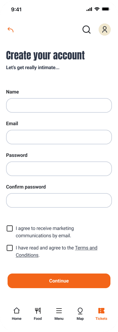
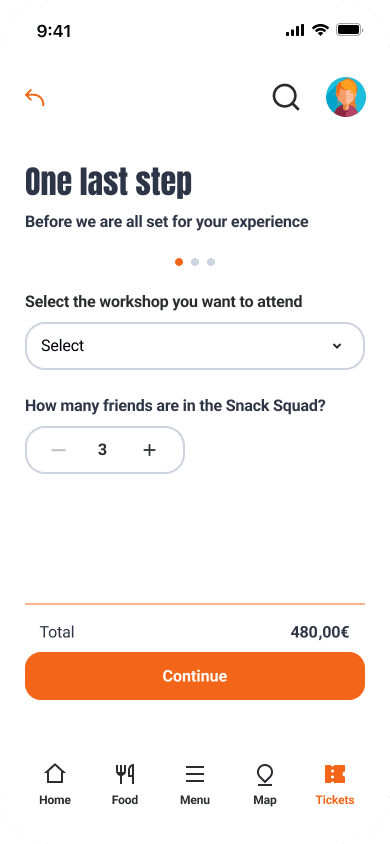
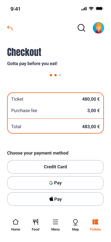
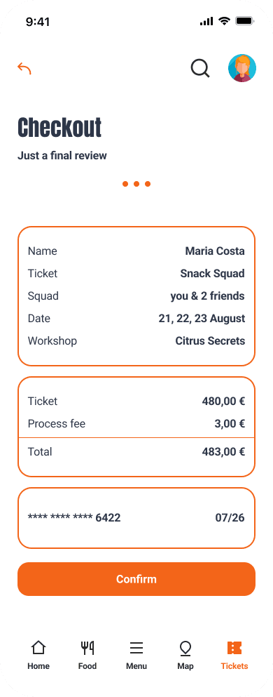
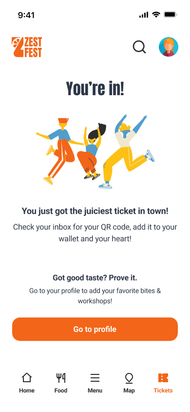
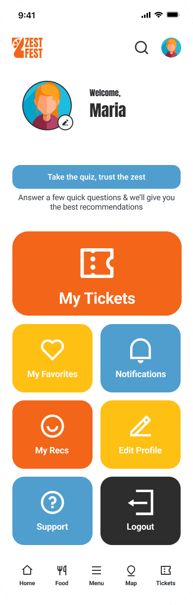
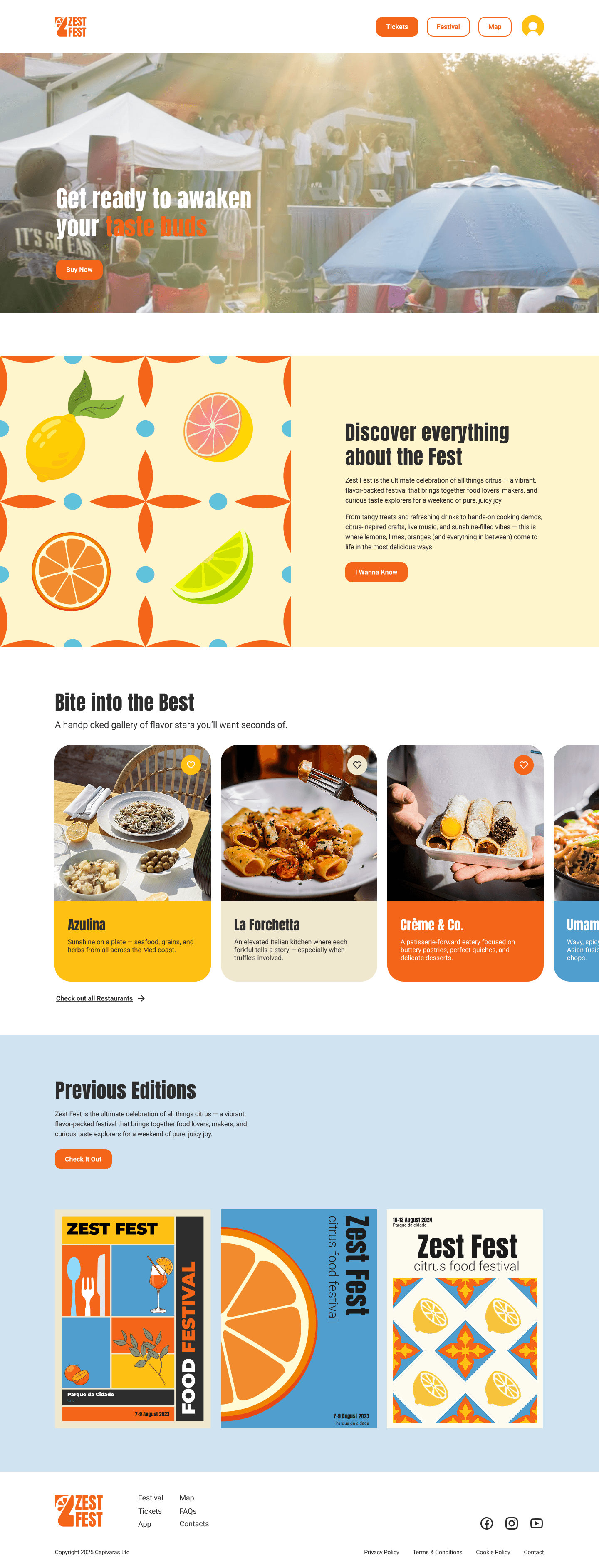
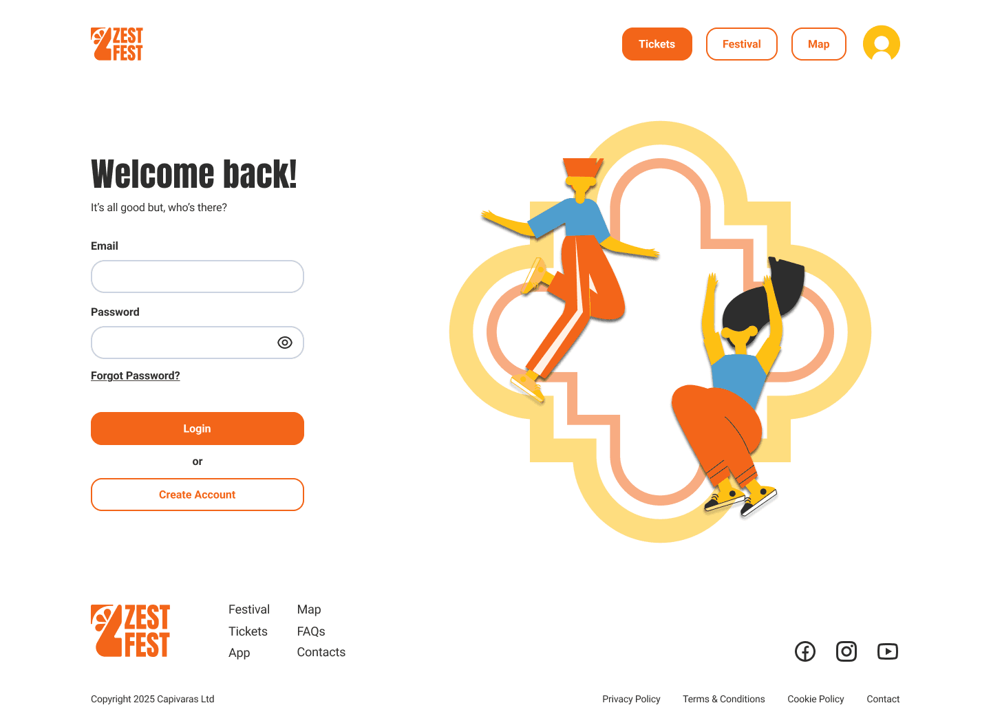
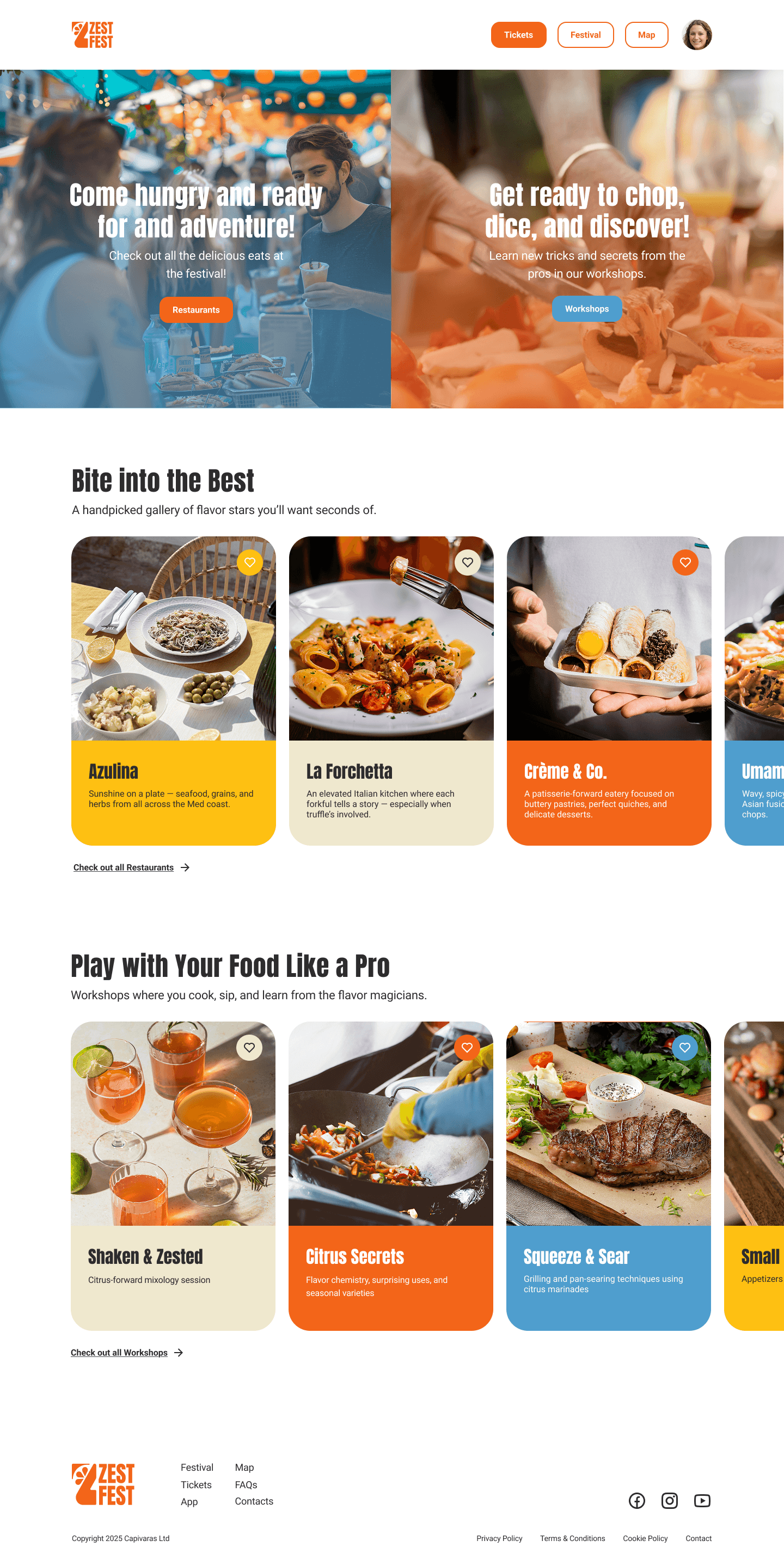
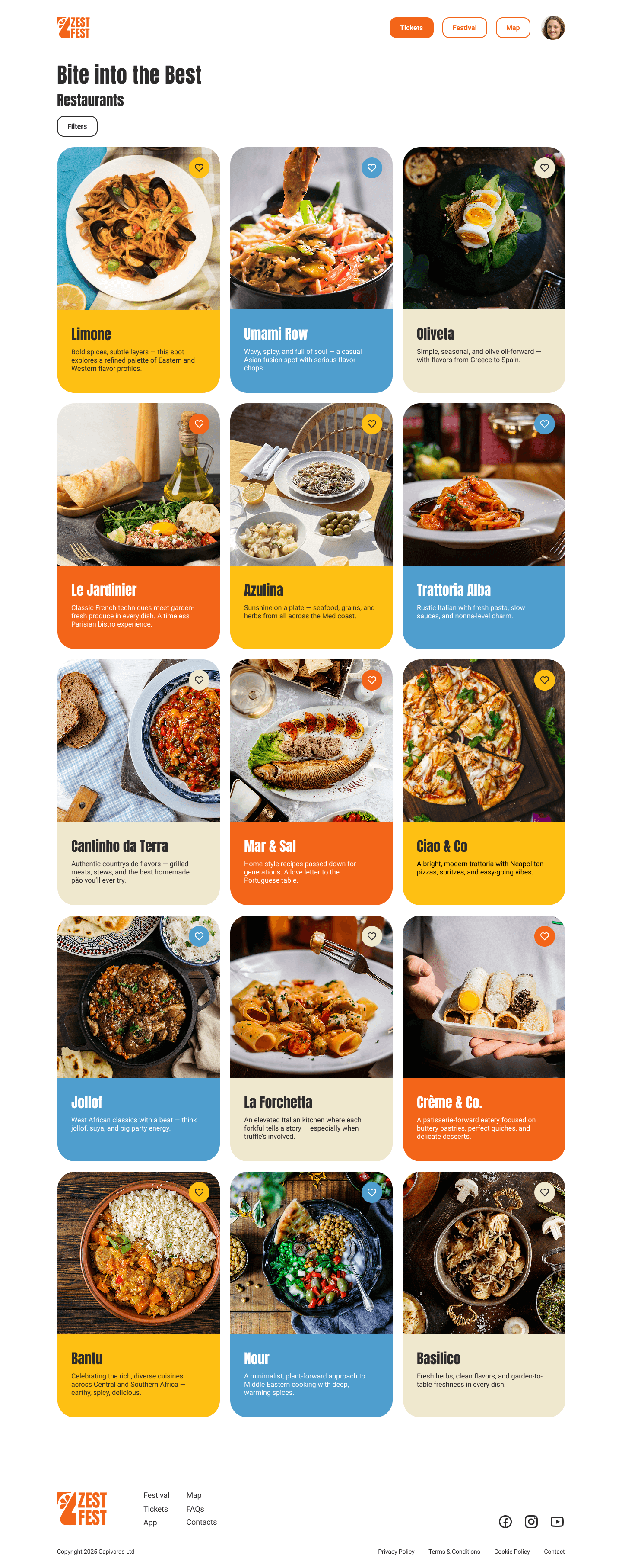
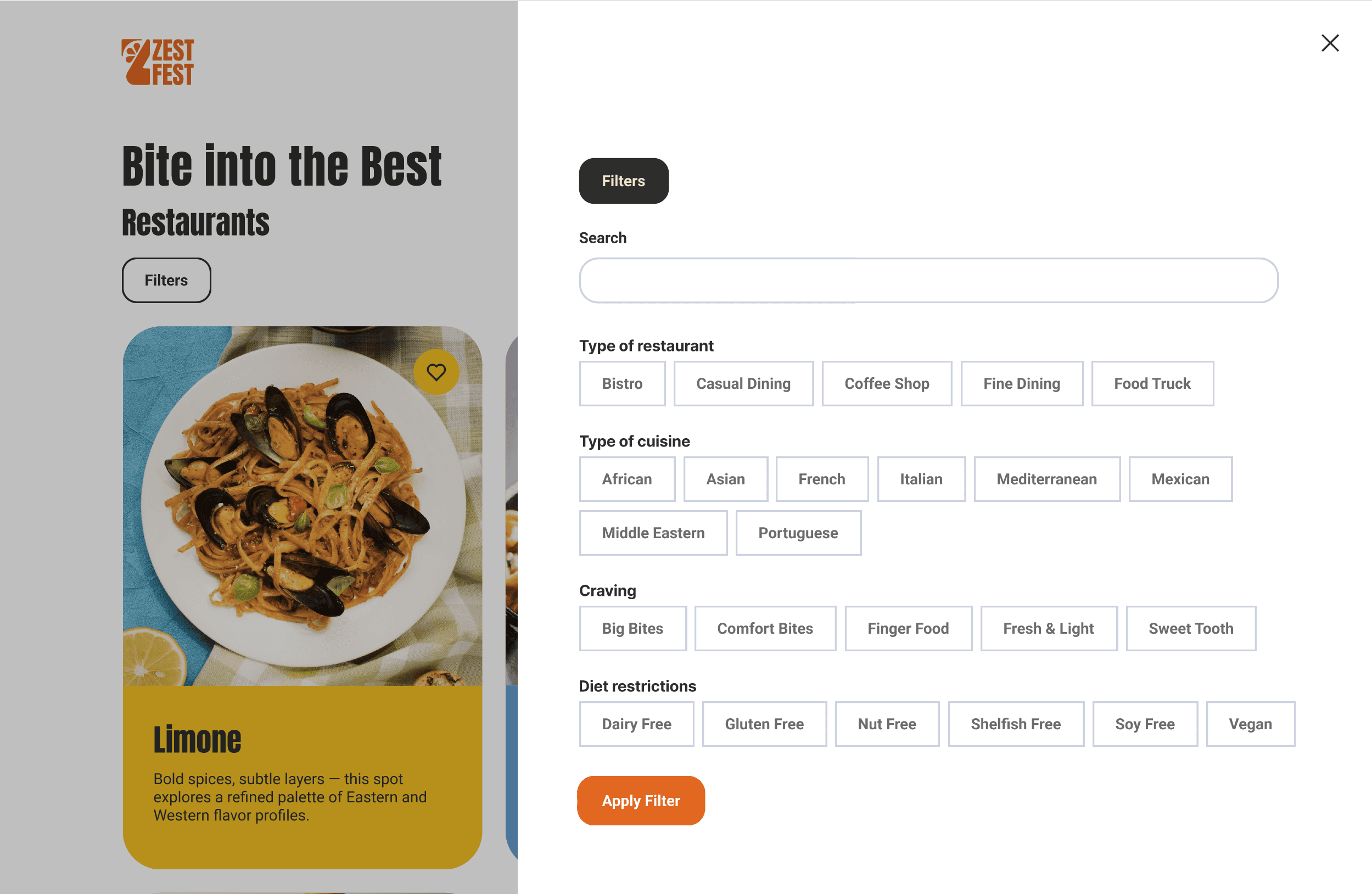
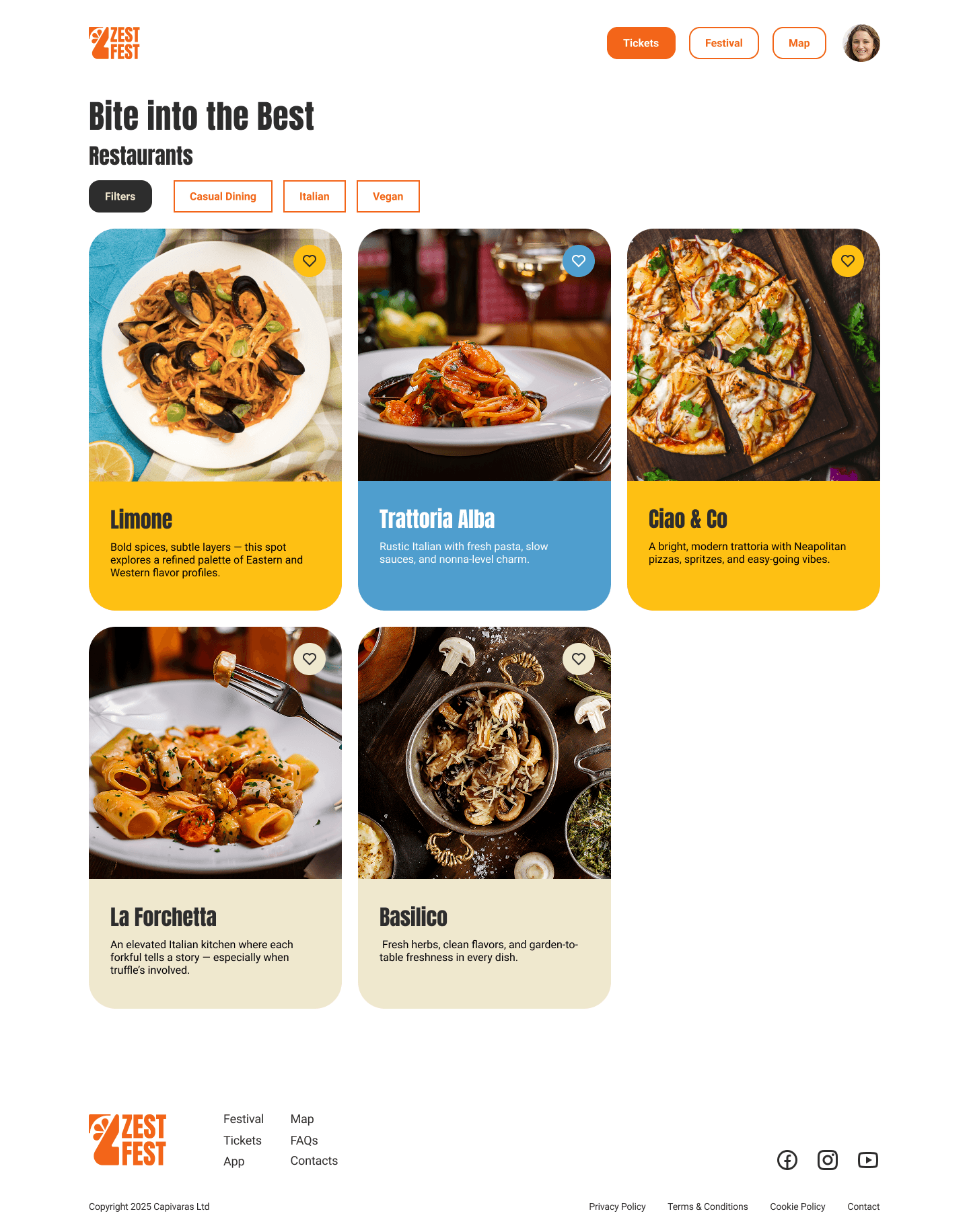
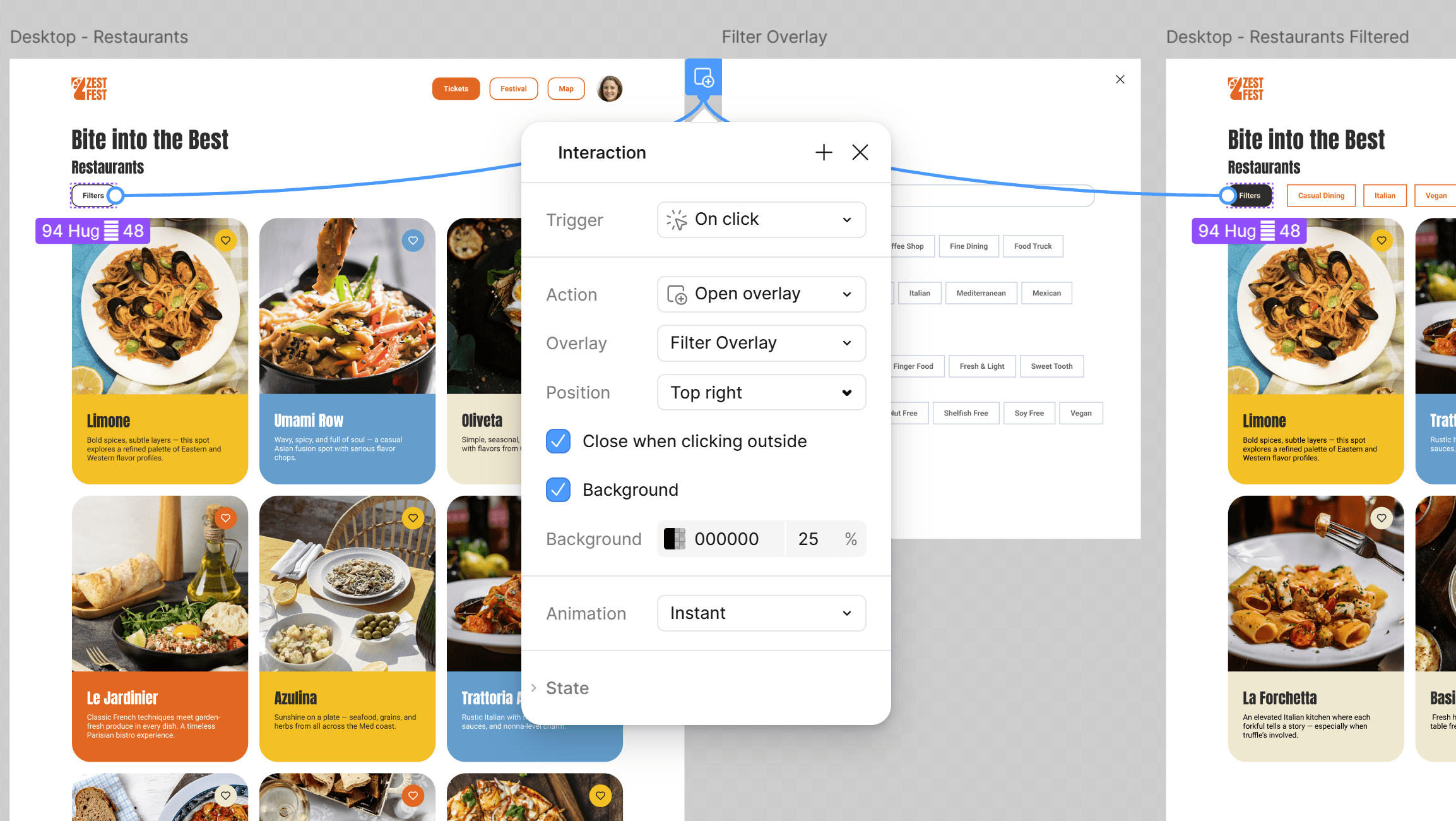
[02] Desktop - Restaurant Page Filters: Home > Login > Home (logged in) > Festival (I wanna know) > Restaurants > Filters > Restaurants page (with applied filters)
[Final Prototype]
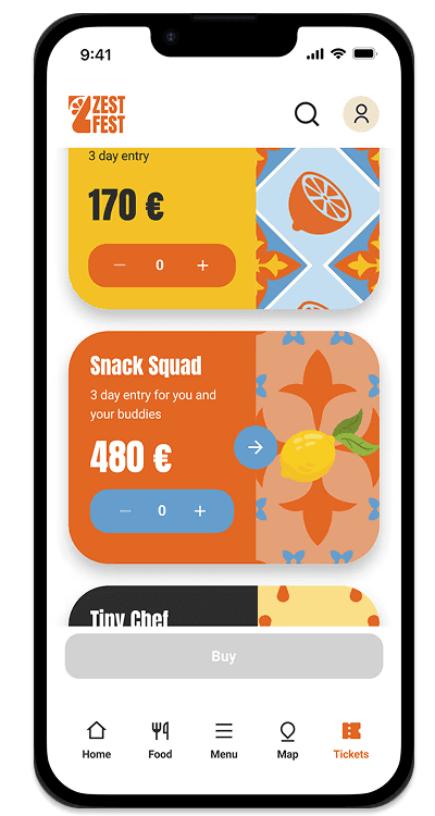
01
Exploration
→ Buttom state: disabled, because no ticket is selected
→ Menu: Ticket page highlighted
02
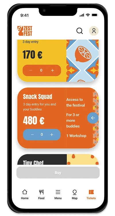
Navigation
→ Account icon: indicates that the user has stilll not created an account
→ Open card: component variation
03
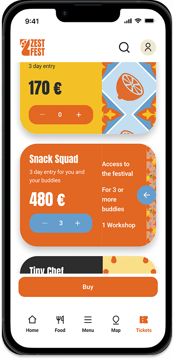
Feedback
→ Buttom state: enabled, because the user added a ticket number
04
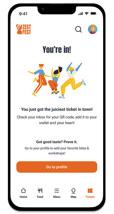
Feedback
After going through the ticket buying process, the user is asked to create an account to finalise the process.
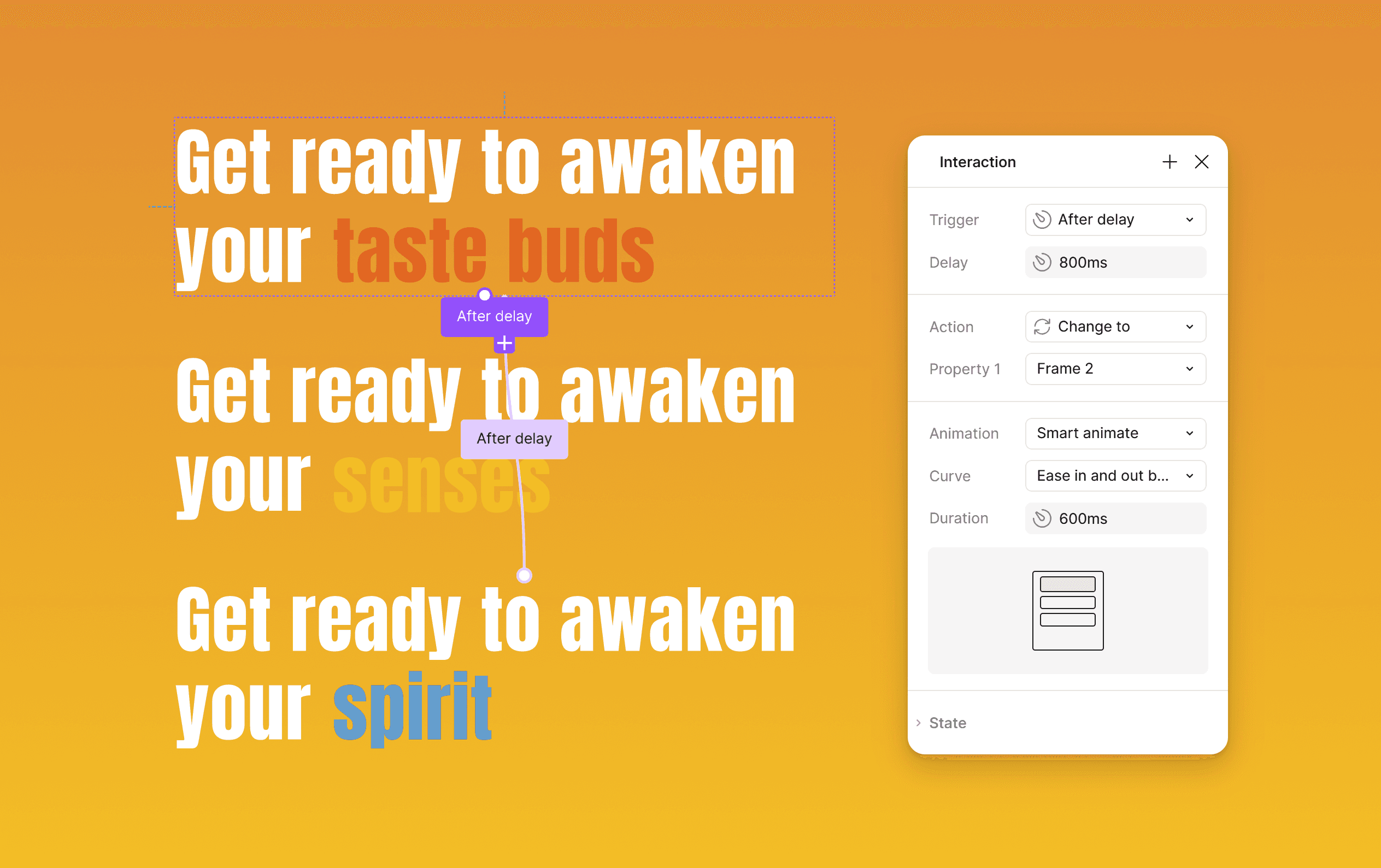
Interaction: Website tagline component text animation
Interaction: Filter Overlay when clicking on 'Filters'
[Features]
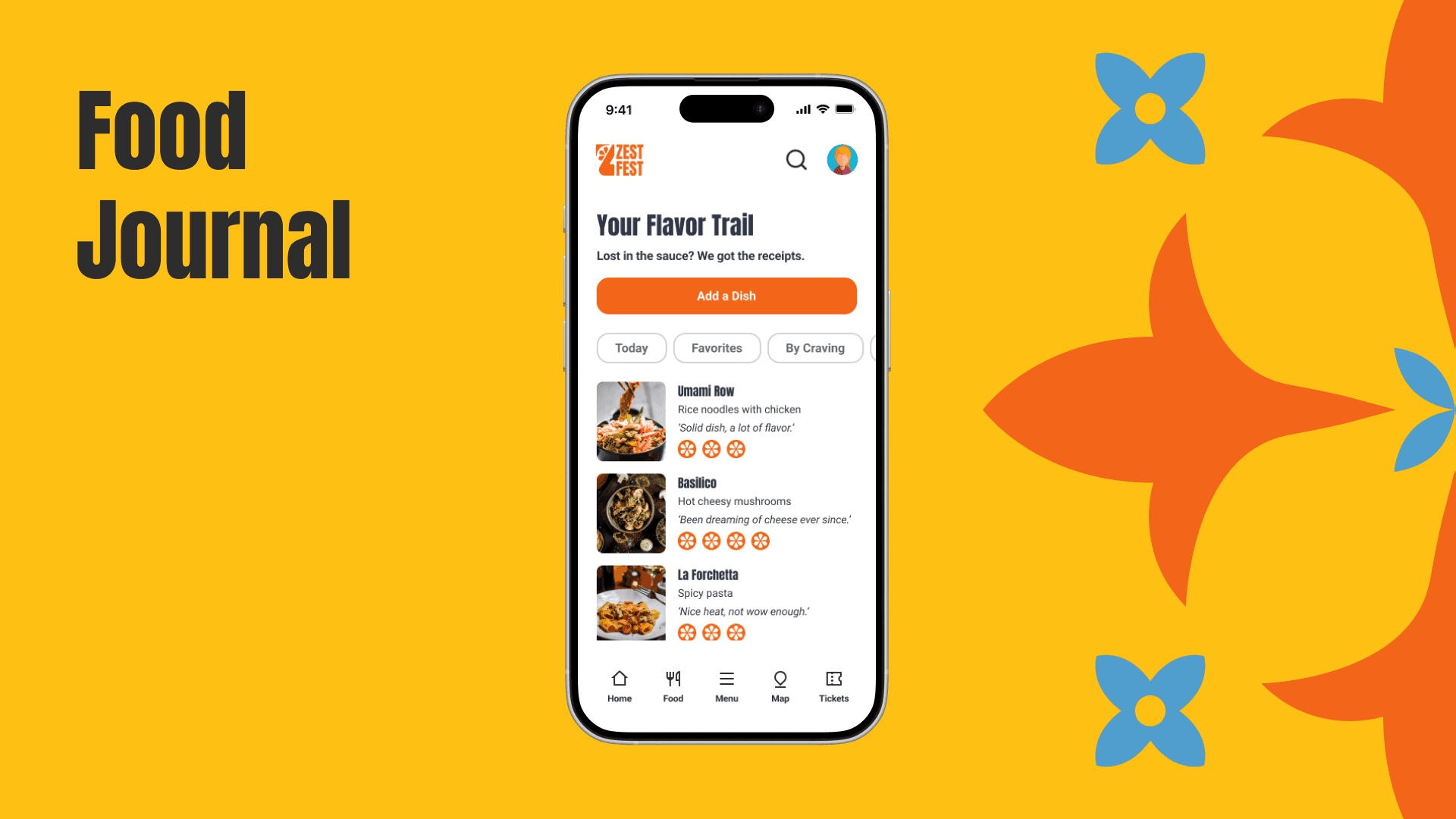
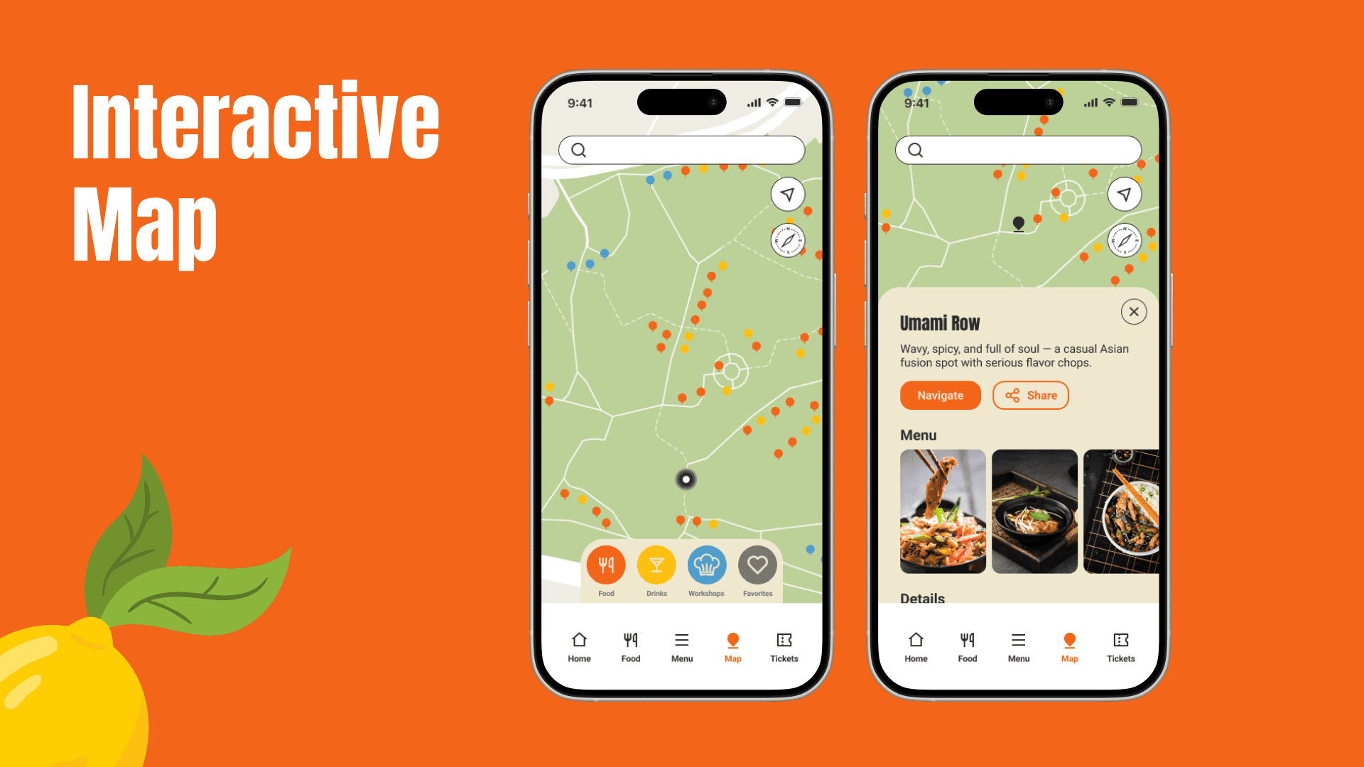
[Outcome]
25% increase in checkout completion rates.
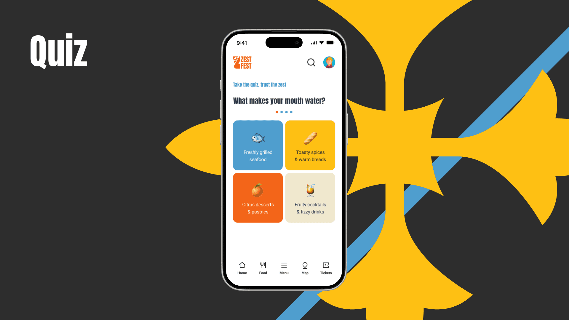
Personalized user experience: A fun quiz feature that provides recommendations based on individual preferences.
Intuitive site architecture: simplified navigation and a custom restaurant list feature to help users better prepare for the festival.
[Key Learnings]
Simplification is key
Users value a quick and easy process, especially on mobile.
Iterative testing pays off
Regular testing uncovered hidden issues and ensured the design met user needs.
Details matter
Small improvements, like error validation and mobile optimization, had a significant impact.